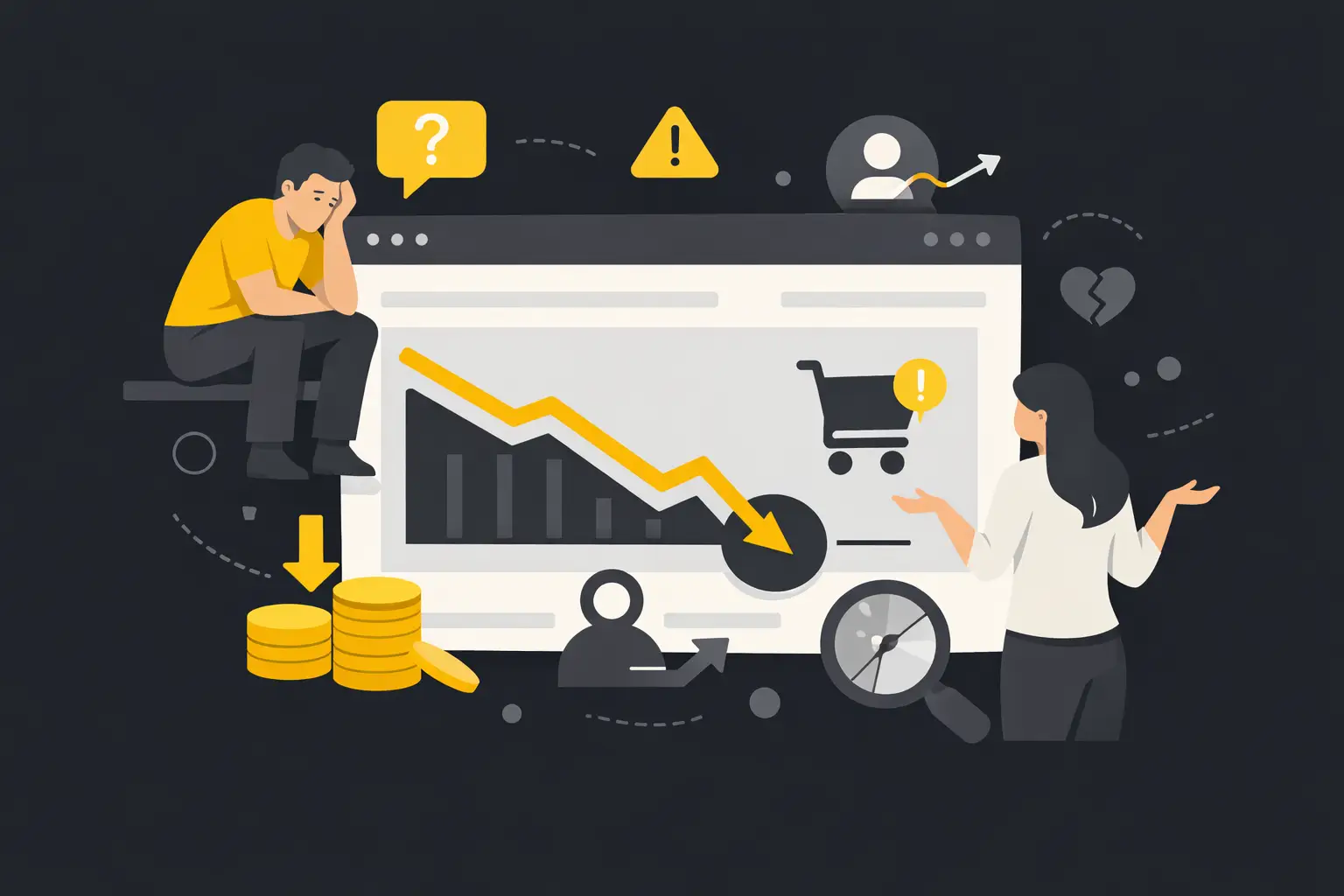
You’re getting traffic, paying for ads, posting content, and still asking, why is my website not converting? That question usually shows up after the budget has been spent and the leads still are not there. The hard truth is this: most websites do not fail because of one big issue. They fail because of a handful of small gaps that quietly kill trust, clarity, and action.
If your site looks decent but enquiries are weak, or your online store gets visits but not enough sales, the problem is rarely just “more traffic”. More traffic to an underperforming website usually means more wasted spend. Before you push harder on SEO or Google Ads, you need to work out what happens after people land.
Why is my website not converting? Start with intent
A website only converts when it matches the reason someone arrived in the first place. If a user clicks an ad looking for emergency plumbing, they want speed, trust, and a clear next step. If they land on a generic homepage full of broad claims, they bounce. Same visitor. Same business. Wrong page.
This is where many businesses get it wrong. They think in terms of pages. Your customer thinks in terms of outcomes. They want a price, a booking, proof you can do the job, or a fast answer to a specific problem. If your page makes them work too hard to find that, they leave.
Traffic source matters here too. SEO traffic often lands on service or product pages. Paid traffic may arrive cold and sceptical. Returning users might need less education and more reassurance. If your messaging treats every visitor the same, conversion rates suffer.
Your offer is not as clear as you think
Most businesses are too close to their own offer. They know what they do, so they assume the website explains it clearly. It often does not.
When someone lands on your site, they should be able to answer three questions within seconds: what do you do, who is it for, and what should they do next? If those answers are buried under vague headings, stock phrases, or design fluff, people hesitate.
Clarity beats clever every time. “High-performance solutions for modern businesses” sounds polished, but it says nothing. “Websites that generate more leads and sales” is better because it ties directly to an outcome. Good conversion copy does not try to impress. It removes friction.
Weak offers also hurt conversion. Sometimes the site is not the main problem. The business is asking too much too soon, pricing poorly, or failing to explain the value behind the price. If you want someone to enquire, book, or buy, the offer has to feel worth the next step.
Trust is either built fast or lost fast
People do not convert because a website exists. They convert because they trust the business behind it.
Trust comes from specifics. Real testimonials. Case studies with numbers. Clear service details. Honest pricing guidance where appropriate. Team photos if the business is relationship-driven. Delivery timeframes that make sense. Secure checkout signals for eCommerce. Contact details that prove there are real people behind the business.
A lot of websites rely on empty trust markers. “We care about quality.” “Customer satisfaction matters.” “Industry-leading service.” Every business says that. It does not help the buyer make a decision.
Proof does. If you helped a client increase qualified leads by 38 per cent, say that. If you service businesses across Melbourne and support clients in places like Moorabbin, Clayton, or Dandenong, that can add confidence for local buyers who want a partner nearby. If you have Google reviews, recognised certifications, or clear examples of work, use them well.
Trust also gets lost through small signals. Outdated design. Broken forms. Slow pages. Thin content. Generic imagery. Typos. Confusing navigation. None of these alone guarantees failure, but together they create doubt. Doubt kills conversion.
Design matters, but not in the way most people think
A visually polished website can still convert badly. Design is not about making the site look expensive. It is about making decisions easy.
Strong design directs attention. It shows people what matters first. It supports the message, not competes with it. Weak design creates noise. Too many colours, too many buttons, too many competing messages, too much movement. The visitor stops processing and starts exiting.
A common problem is trying to say everything at once. Businesses want to show every service, every feature, every audience, every selling point on one page. The result is clutter. Good conversion design is focused. It gives each page one primary job.
This matters even more on mobile, where space is tight and patience is lower. If your site looks fine on desktop but becomes annoying on mobile, you are likely losing a large chunk of potential leads or sales. Mobile conversion issues are often simple: hard-to-tap buttons, endless scrolling before the offer appears, slow image loads, and forms that feel painful to complete.
Why your website is not converting even with traffic
If you are asking why your website is not converting despite healthy traffic numbers, look at quality before quantity. Not all visits are equal.
You might be attracting the wrong audience through broad keywords, weak ad targeting, or content that pulls in information seekers instead of buyers. A page can rank well and still bring in visitors with no commercial intent. That inflates sessions and flatters reports, but it does not grow revenue.
You also need to look at campaign-message match. If your ad promises one thing and the landing page delivers another, conversion drops. If your SEO content answers a top-of-funnel question but pushes a hard sale too early, conversion drops. The closer the message matches the user’s intent, the stronger the result.
This is where proper tracking matters. Many businesses think the website is underperforming when the real issue is bad measurement. If form submissions are not tracked correctly, phone calls are invisible, or eCommerce events are broken, you are making decisions off incomplete data. You cannot optimise what you cannot see.
Your call to action is too weak, too vague, or too early
A conversion does not happen by accident. You need to ask for the next step clearly.
Too many websites hide behind soft calls to action like “Learn more” or “Get started” without enough context. That works when the visitor already knows what comes next. It fails when they need reassurance.
A stronger call to action sets expectations. “Book a strategy call.” “Request a quote within 24 hours.” “See pricing.” “Add to cart.” “Download the capability statement.” Clear beats broad.
Timing matters too. If you ask for the sale before you have built enough value, people hesitate. On the other hand, if every page is pure information with no clear next step, people drift. Good websites move users through the right sequence: problem, solution, proof, action.
Forms are another conversion killer. If your enquiry form asks for too much, completion rates drop. If your checkout has too many steps, carts get abandoned. Every extra field or click needs a reason.
Speed, usability, and friction still cost you money
Page speed is not a vanity metric. It affects conversion because it affects patience. Slow sites leak revenue. People will wait a little if they really want what you offer, but not for long, and not if your competitor feels easier.
Usability matters just as much. Can users find key pages quickly? Can they call you from mobile without zooming in? Does the checkout work cleanly? Do product pages answer obvious questions about shipping, returns, sizing, or availability? Does your service page explain what happens after someone enquires?
Friction is anything that makes the next step feel uncertain, slow, or risky. Remove enough friction and conversion improves without needing more traffic.
Fix the biggest leak first
The smartest way to improve conversion is not to change everything at once. Start with the page that gets meaningful traffic and has a clear commercial role. Then analyse where the drop-off happens.
Look at user behaviour, not opinions. Where do people exit? How far do they scroll? Which devices underperform? Which traffic sources bounce hardest? Which forms start but do not get completed? Pair the data with common sense. Then test focused improvements.
That might mean rewriting the hero section, tightening the offer, adding stronger proof, simplifying a form, improving mobile layout, or building landing pages that better match your campaigns. Sometimes a small change lifts conversions quickly. Sometimes you need a broader rethink. It depends on where the disconnect sits.
The key is to stop treating conversion as guesswork. A website should be measured by what it produces: leads, sales, bookings, revenue. Not just clicks and compliments.
If your website is not converting, do not assume you need a full rebuild or a bigger ad budget. You may just need sharper messaging, better page intent, cleaner UX, and stronger proof. Get those fundamentals right and the traffic you already have becomes far more valuable.
A website should not just look credible. It should help your business grow. If it is not doing that, the problem is worth fixing properly.

.svg)



.webp)




.svg)

.webp)

.webp)